
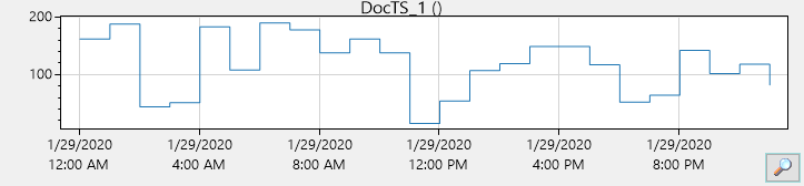
Graphical Representation of Selected Time Series
Graphical representation in the TSM mask
When at least one time series is selected the HAKOM logo is replaced by the graphical representation of the selected time series. It is refreshed every time there is a change in the period or another selection is made.
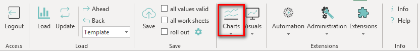
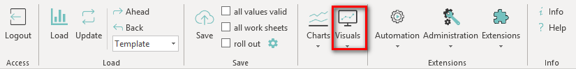
The graphical representation of a time series can also be called from an active template by choosing on of the chart types under the "charts" ribbon:
Contextmenu
Through a click of the right mouse button within the chart the context menu is opened. It offers a couple of options when using charts.
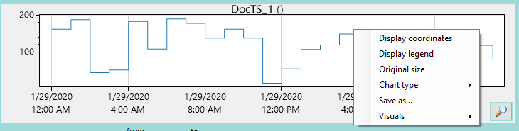
- Display coordinates
When this function is active, the current time and value of the selected time series is displayed when hovering over the graphical representation. - Display legend
Switches between legend on or off. - Original size
Restores the Chart to the original size, after it was shifted or zoomed in. - Chart type
Here you can choose between the different chart types available. - Save as...
The displayed diagram can be saved. - Visuals
This option opens the TSM Visual Dashboards, if you have a license for them. For more information on the TSM Visuals see 11570688.
Move/Zoom Within the Diagram
- Move
By clicking and holding the left mouse button the displayed area can be moved.
By clicking on "Original size" the originally displayed time range will be restored. - Zooming
There are several ways to zoom:- Only with the mouse wheel
If you zoom with the mouse wheel only, the area over which the cursor is located is zoomed in. - Pressing and holding the Ctrl key
If the Ctrl key is held down while zooming, the zoom is performed without changing the Y-axis. - Pressing and holding the Alt key
If the Alt key is held down while zooming, the zoom is performed without changing the X-axis.
- Only with the mouse wheel
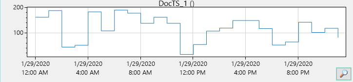
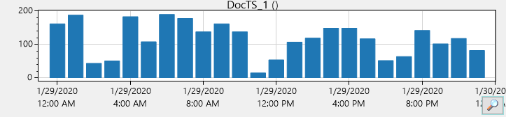
Chart types
There are three different chart types to choose. The gradual chart is set as default.
Line chart
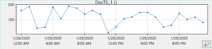
Step chart
Bar chart
TSM Visuals - A short introduction
Starting the TSM Visuals
The TSM Visuals are available for a deeper visual exploration of time series. They are opened over the "Visuals" ribbon when a time series is loaded in Excel:
This openes a drop down of all available dashboards:
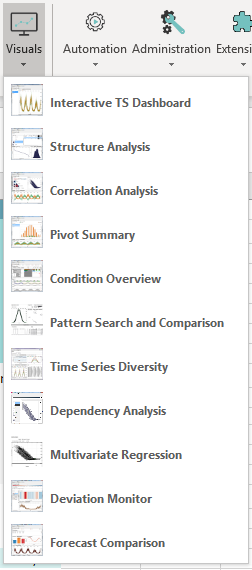
The dashboard "Interactive TS Dashboard" is included in the TSM standard license. All other dashboards require a licence of the TSM Visuals.
After a click on "Interactive TS Dashboard" the TSM Visuals are opened and the window for role assignment pops up. This dashboard has two mandatory roles that have to be assigned:
- Date
- Use Time Series
If the TSM Visuals were started from the TSM these roles are usually assigned correctly.:
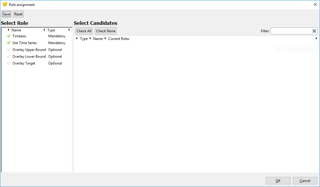
If the TSM Visuals are started via the TSM, these roles are usually assigned correctly. With a click on "OK" the time series is loaded into the dashboard.
Display of Data
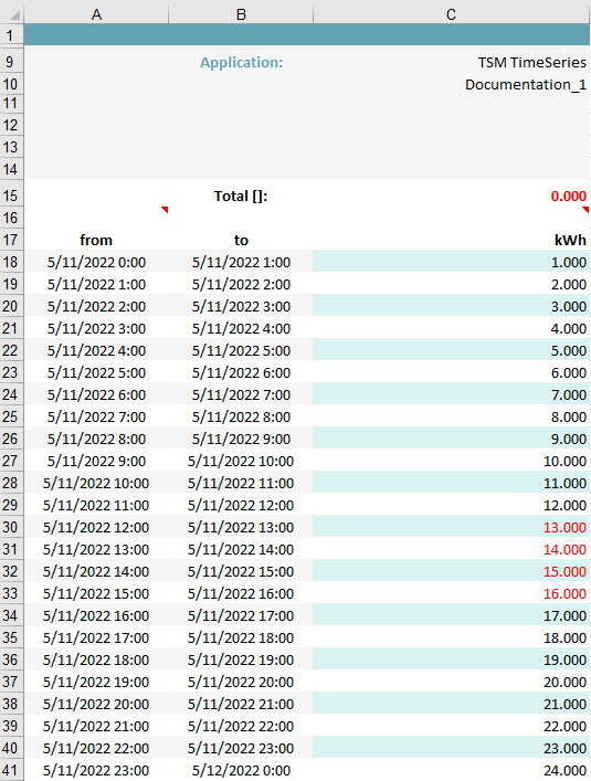
The following data is used for this example:
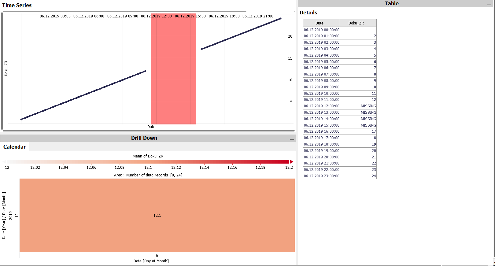
Calendar:
Initially the calendar shows the color coded mean of a selected time series for single days. Each colored field (each cell) aggregates the data that falls into the respective time interval. In the example above, that is just one day. If the selection has been restricted using the Focus, the coloring considered the data within the Focus only.
Table:
In this scrollable table, the selected rows (i.e., the "focus") of the selected time series are displayed both numerically and visually. You can also refine the focus by clicking individual rows in the table or by draging a line over the tablerows. The focus then contains only the rows displayed in full intensity, while the rest of the table is grayed out as the context.
Fokus:
The Focus allows the user to take a closer look at a certain area of the data.
Saving Data from the TSM Visuals into the Database
It is possible to edit time series data within the TSM Visuals and then save them to the database.
To start the editing mode, click on the button "Start Data Editing..." in the menu bar. A yellow bar is now displayed above the dashboard:

There are now two ways to edit the time series data:
- By selecting the data in the diagram
Creating a focus opens a context menu: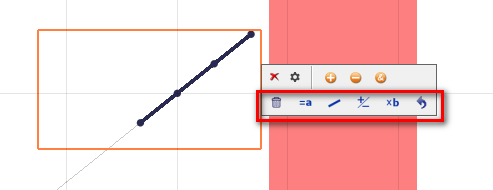
You can use this to edit the data in the focus. - By selecting the data in Table
When hovering the mouse over a table entry, an arrow symbol is displayed:
A click on it opens a menu that allows editing the data of the selected line.
If data has been changed, this is indicated in the table by a blue marking:
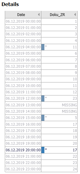
In the yellow bar above the dashboard it is possible to accept or reject these changes:

Values that have not yet been transferred are marked with an asterisk in the table (see graphic above).
If changes have been accepted, you can save them directly to the database by clicking on "Send Edited Data to TSM":
After updating in TSM, the time series looks like this:
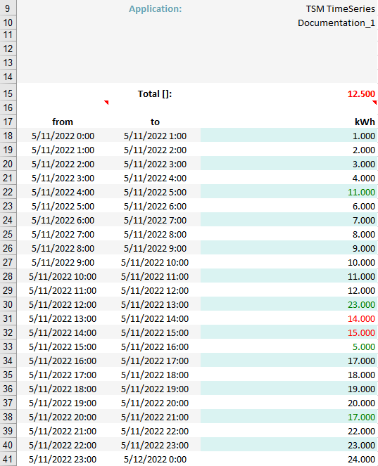
The edited values have received the flag "manually replaced".
Further information
The documentation on the TSM Visuals can be found by clicking the blue "i" under "Help":

Here you will find a more detailed description of the available dashboards an possible actions and interactions between them.